Using InDesign Styles to easily add a padded keyline…
If you’ve been in the design business long enough, you probably remember a time when adding a padded keyline around images in magazines, newspapers and booklets was all the rage. Rage is a great description!
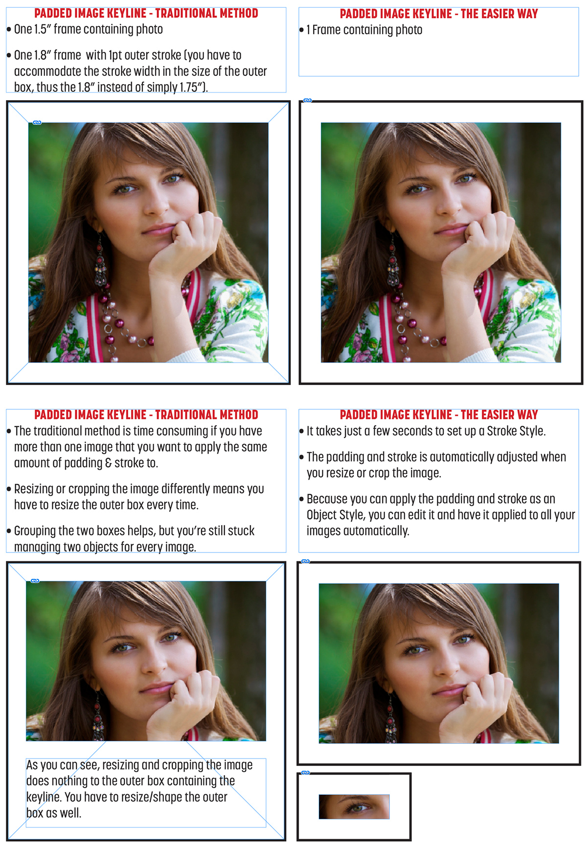
It was rage-inducing for designers, because it required you to place your image in one box, then draw another box around it for the “padding” and apply the stroke to that box. Ugh!!
Getting all the images to have the exact same amount of padding was a pain, and so was having to resize two boxes every time you cropped or resized a photo.
Thankfully InDesign offers a simple solution to this old problem in the form of a Stroke Style and it’s really simple to set up.

How to create a custom stroke
- Place your image and crop it to your liking.
- Open the Stroke panel and go to the flyout menu in the upper right of the panel.
- Click New
- In the New Stroke Style dialog box, give your new stroke a name (padded image keyline, or something like that).
- Select Stripe from the Type drop-down menu
- Move the bottom black bar all the way to the bottom so it disappears and there are no numbers listed below it in the Start % and Width % boxes. This is what creates the “padding.”
- Click the thin black line at the top and set the Start to 0% and the Width to 10%.
- Click OK.
- Now, with your image selected, set the Stroke width in the Stroke panel to 10pt.
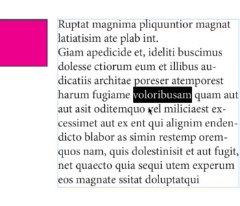
This should end up giving you about a ⅛ inch padding around your image, with about a 1pt keyline.
The reason you’re setting the stroke width to 10pt is that your custom stroke is applied as a percentage, not a set amount. In my case, 10% custom stroke on an object with a 10pt stroke gives me the .125 inch padding with about a 1pt keyline.
The numbers aren’t exact, but visually it’s exactly what I was looking for.

You can play around with the Width % of the custom stroke, as well as the stroke width you apply to the photo to get different amounts of padding and stroke width. Or you can actually do the math to get precise results… but I became a designer to avoid doing math, so I prefer to just go with what looks right.
