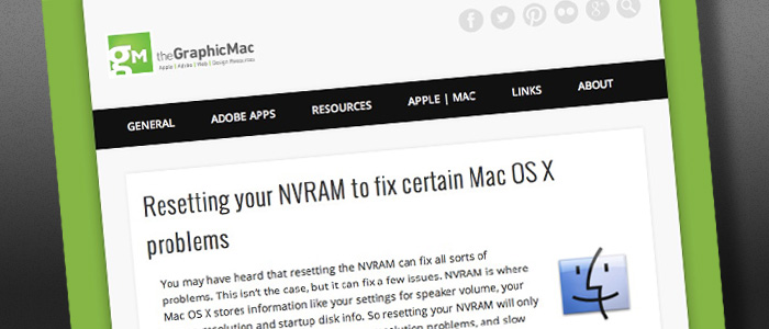
As I looked through the analytics for The Graphic Mac over the last year it became increasingly obvious that more and more users were viewing it on iPhones and iPads. Unfortunately, the old theme of the site didn’t work as well as I had hoped on mobile devices. It was also quite cluttered in general. So I started looking for something a little cleaner to use. Today, you see the results.

The categories are listed in menus (when applicable) at the top in a desktop browser, but when you view it on a mobile device (or simply by resizing your browser window to be really thin), it places the navigation in a small drop-down style menu. The content is a lot more readable on mobile now.
Do you want comments?
The next step is deciding whether to allow comments on blog posts. I’ve had them turned off for a few years now, but I’m considering turning them back on (as I have for this post.) If I do turn them on, I won’t be using native WordPress commenting. Instead, I’ll be using either the Facebook Commenting System (like you see on many sites such as BuzzFeed), Disqus (which is used by the guys over at The Loop), or LiveFyre (which TechCrunch uses).
I’m leaning toward Disqus. It allows you to log-in using Facebook, Twitter, Google+, or a Disqus account. It also allows you to up vote or down vote comments, as well as share those comments via Twitter or Facebook.
[zilla_alert style=”green”] Ultimately, it’s up to you. I’ve turned on comments for this post, so let me know what you think below, or send me a note via the contact page (found under the About link at the top of the page). [/zilla_alert]
As you can see, the new site drops the sidebar, and reduces the lower half of the homepage to small summary-style boxes for the posts. It is my hope that the new design puts the focus squarely on the content. It’s not perfect, and I hope to fix small issues along the way, but I wanted to go live with it as soon as possible.
I hope you like the new site. And I also want to thank everyone for visiting the site for the last 10 years (starting with the original CreativeGuy blog). While the site was never designed to make me money, I do thank anyone who has ever clicked an ad (of which there is currently only one found down in the footer). It is my intention to keep the site as ad-free as possible.

Has this site ever had comments? I would like to see them but I dont think they are necessary.
Hi James.
DIsquus is pretty smooth. I’d allow anonymous comments, but only after queueing for approval.
I’m not fond of the eye-searing green on the sides of the content box.
Ads would be ok if, as mentioned above, they were pertinent. An ad solution I really like (because it’s understated) is the one Matt uses on Metafilter.
Cheers.
I actually liked the bright green background, but I received several messages about it from folks who didn’t mind it on their iPhone or laptop, but didn’t care for it on the desktop (since so much of it shows).
So I’ve updated it to the darker gray color. I hope it’s a little easier on the eyes.
It very much is easier on the eyes. Thank you.
Although the menu, navigation is way better now. The colours are not standing out to me. I don’t like this in the face-green colour for the site.
Also I agree on the disquis comment system.
Anything but facebook commenting. Disqus is pretty nice.
Comments = YES
Voting them up and down = YES
Ads = Sure. As long as they are relavent. Nothing wrong with making a little supplemental income.
comments = yes,
voting them up and down = yes
ads = actually why not, as long as they stay within the area of our common interest (i’m thinking fonts, brushes, tutorials, books etc.). They can be interesting as well, and why would you not get some credit for pointing them to us? Or perhaps some sponsoring model simillar to what happens at minimalmac.com
Thanks for the input, Antoni.
The problem I have with ads is that I mostly hate them on other sites because they quickly grow out of control. I’ve explored the “sponsorship” model in the past, but soon realized it was more work than it was worth (at the time, anyway).
By the way, you’re the first person I’ve ever seen say something positive about ads in a blog comment. Usually it’s the “I’ll remove your from my RSS feed/bookmarks if I see ads” type of comment.
Whatever you choose, make sure it can let you delete duplicate comments. heh.
I removed your duplicate. And thanks for chiming in.
I think comments can add a whole new layer of content value. I find that I usually learn as many new tips, applications and hacks from the comment feeds as I do from the tech blogs themselves.
I’ve played around with Disqus a little, not much else. I’d prefer to stay away from the proprietary nature of Facebook’s system.
I think comments can add a whole new layer of content value. I find that I usually learn as many new tips, applications and hacks from the comment feeds as I do from the tech blogs themselves.
I’ve played around with Disquis a little, not much else. I’d prefer to stay away from the proprietary nature of Facebook’s system.