 General
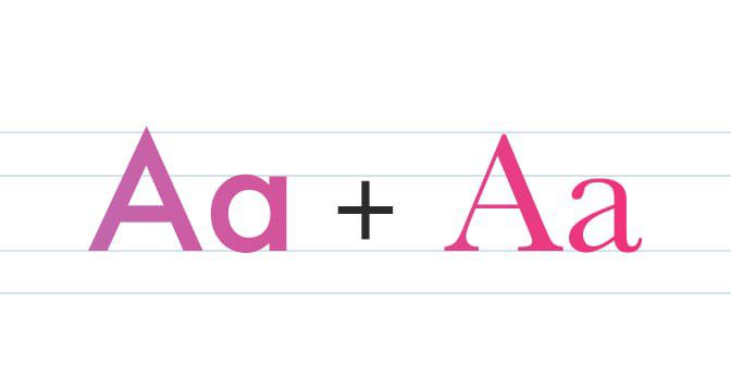
Do You Really Need More Than One Font?
No, I’m not talking about your font collection, I’m referring to your design/layout.
Read more “Do You Really Need More Than One Font?” General
No, I’m not talking about your font collection, I’m referring to your design/layout.
Read more “Do You Really Need More Than One Font?” → General
Horrible cliché stock photography. It’s certainly not limited to the topic of artificial intelligence, but yeah… it’s pretty bad, and it’s approaching the scale of Customer Service Girl.
Interesting read, and it points out a real problem in the design industry. Conveying an idea with the use of stock photography is nothing new, but finding the right photo to do it is time-consuming and in some cases nearly impossible. Designers have been battling the infamous “customer service girl on phone” problem for decades… and the best photographers have come up with is to switch from a corded phone to a headset for the models.
 General
Following up with a previous post on showing your client logo design options, I have a new article to share with you.
Read more “Myths of logo design” → General
The subject of “logo options” came up for me recently in the form of the question: “how many logo options should I show my client?” My answer was that I put my very best effort into one logo design. If a client doesn’t like it, they can pay me for another logo design option or find another designer to work with. I refuse to waste my or my client’s time by providing my best idea, and then two to three more really shitty ideas just to fulfill some quota of “options.” Besides, the client will ALWAYS choose the shittiest option you show them, so I just don’t do it.
When Steve Jobs asked Paul Rand for some “options” for the NeXT logo design, he offered the now famous reply
Read more “How many logo design “options” should you show?” → General
I couldn’t agree more, on all points.
As a side note, what’s up with dude’s hair?
 Apple | Mac
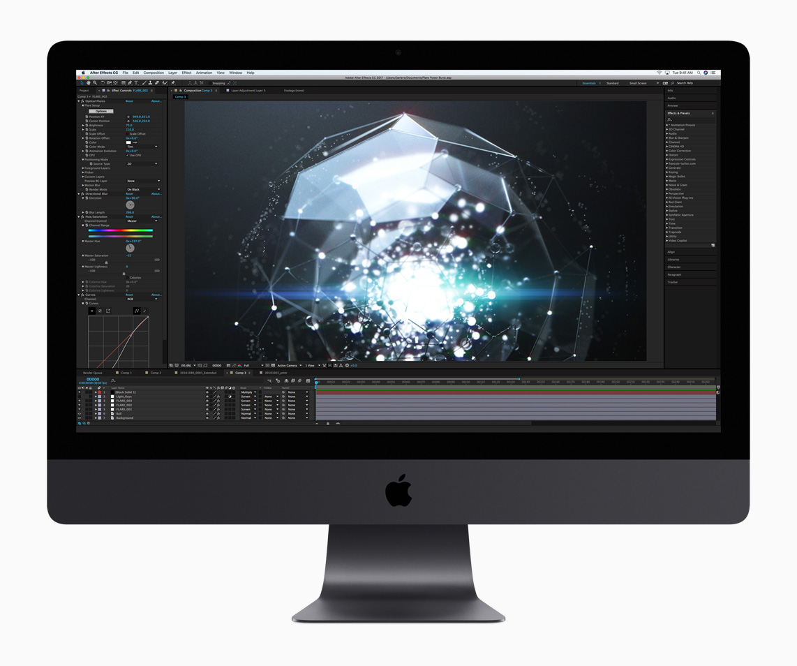
Let me be clear, I haven’t even seen an iMac Pro in person. If you want a fantastic first-impressions review of the iMac Pro from someone who has, look no further than Rene Ritchie’s iMac Pro first impressions: Beauty of a beast review at iMore. It’s excellent.
 General
Yeah, I get it. You’re not a copywriter. But you’re probably a designer, and that means you’ll be writing at some point in your career—even if it’s just a headline or two.
I love these quick grammar lesson types of articles.
 Adobe Photoshop
A comedic look at some great Photoshop tips and advice.
Read more “Top 10 Photoshop tips the experts don’t want you to know!” → General
If you work for a company, you likely have little-to-no control over the work you create. The company generally owns the copyright on anything and everything you do. But if you’re a freelancer, it’s a whole different ballgame.
 General
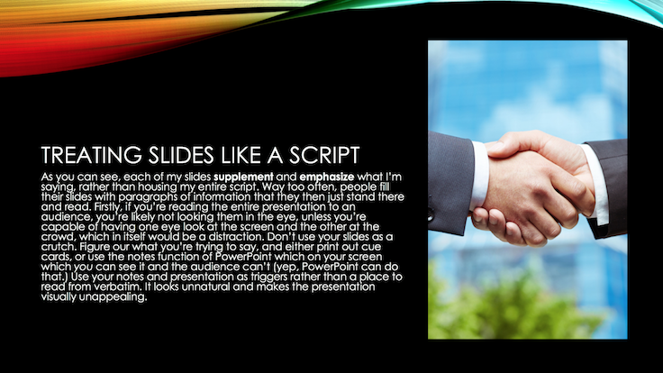
I know how to read, goddammit—and I can read the slide faster than you can read it to me. Not to mention, you sound like an uninformed idiot that had an intern copy & paste text from Google into a slide.
 General
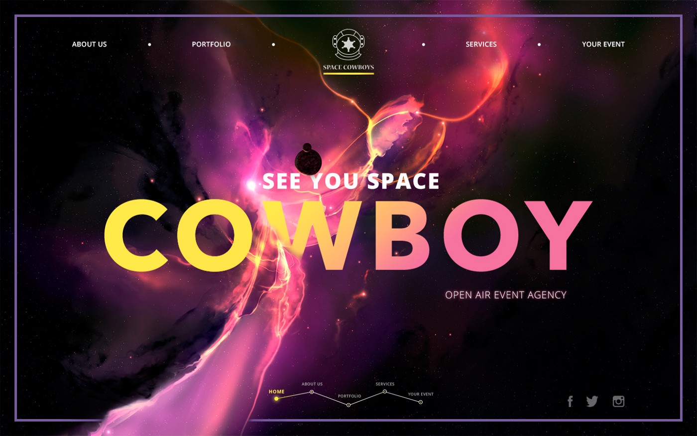
The more objects attract user’s attention, the harder it is to concentrate on the vital ones.
That quote pretty much sums-up design principles in general, doesn’t it?
UX Planet has some great advice about website header design, which by the way can also apply to email headers as well.