Logo Trends 2010
For many years, successful logos were built from beautiful shapes. They were usually one color, or perhaps they incorporated a few colors. Now, designers have begun to look at the actual surface of the shapes as an entirely new canvas that can be addressed in myriad ways. Good draftsmanship and good ideas are still crucial to the process, but surface effects now add entirely new levels of meaning.
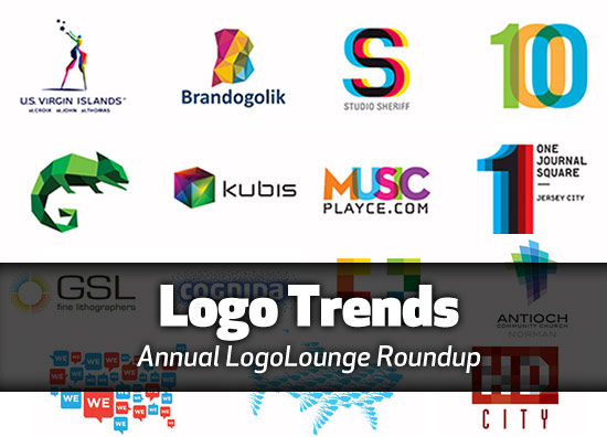
That’s just one of the observations made by LogoLounge in their 2010 Logo Trends article. As always, this annual article is a must-read.




6 COMMENTS
I wrote an article titled “9 rules to creating a logo you can live with and still get paid” about 3 years ago. I lost some of the 100+ comments on the article when I switched over to WordPress, but it was quite popular.
Definitely share with any designer friends who ask you about logo design:
https://www.thegraphicmac.com/9-rules-creating-logo-you-can-live-and-still-get-paid
Several designers don’t think of the media where the logo will to be printed on. When designing a logo, the artist should think of the various media where the logo may be used in future
James & amack, I agree completely.
I don’t do an awful lot of logo work, but two questions I always ask myself when designing one are:
A. How will this look if it’s faxed?
B. How will this look if it’s embroidered on clothing?
Some of the images are gorgeous as illustrations, but there’s no way they should be used as logos.
@james
ya am agree . Its just trends and can’t put force that it is great.Every person has own views
I don’t disagree with you… but LogoLounge is simply sharing the trend of the designs, not necessarily (I hope) that they’re great designs.
You point out a common problem shared by many of these “logo inspiration” sites. They’re miniature illustrations, most of which would never fly as a logo for a real company.
I went to LogoLounge and looked at every design. Nearly all were done for the glorification of the artist, not the good of the company. I say “artist” because designers know that a logo is not simply a miniature artwork surrounded by a few buzzwords.
Comments are closed.