Logo trends 2007: The latest “in” styles
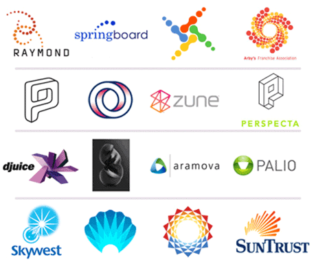 I always look forward to Bill Gardner’s yearly trend outlook on logos over at LogoLounge. The 2007 logo design trends article is no exception. Last year’s assortment of orbs, buttons and splats give way to 3D, flowery, non-cmyk-reproduceable, wireframed logos – watch as they proliferate into oblivion, my friends. While most of them are cool, I’m seeing a slight move toward the outrageously complicated logo mark. Overly complex, 3D, or brightly colored logos simply don’t reproduce well in traditional print, but with so many Web businesses popping up, it really doesn’t matter. And while the “print purist” in me cringes, the designer in me rejoices. FREEDOM!!!

