Hey Apple, give me what I want (cause surely…
I normally ignore such fluff, but this past week I managed to come up with a list of a few things that I think Apple should build-in to Mac OS X to make me happy. Because you know if I want it, chances are that everyone else on the planet does too, right?
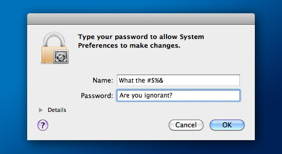
For starters Apple, since I’m smarter than your average rock and managed to set up my Mac’s user account with administrative privileges, can you please stop asking me for my God-foresaken password every time I want to install something? Please! I get it, security and all that. But I’ve set myself up as an admin user for a reason. Can you at least offer the option of not asking me for a password? I know, enabling that feature will require me to enter my password, but that’s ok this one time!
Wait Apple, don’t run off just yet, I’ve got more.
I’ve not been a huge fan of Apple’s Spaces feature on my MacPro – a 30″ LCD allows me plenty of space. But on my 13″ MacBook Pro I have little screen real estate, so I use Spaces quite a bit. One thing that bothers me to no end is that there appears to be no way to not show the icons on my desktop in any given Space. I would really love to have desktop icons only show up in one specific Space, and no others. I tried adding the Finder to show up only in Space 2, but of course that does nothing – and you can’t select individual folders to show up in specific spaces.

Dashboard has suffered the wrath of “we just don’t care” from Apple for a long time. Windows 7 offers a form of Dashboard widgets in a nice floating dock on the side of your screen, a feature I like because it doesn’t take over my entire screen. It sure would be great to have Dashboard slide in to view from the side of the screen at a specified size like you see above – keeping the rest of my desktop in place and usable, and stay there until I hit a keyboard shortcut to send it away
Speaking of features that could do so much more, how about you do something with the built-in disc burn function. I can overlook the lame font management, but burning a CD or DVD on the Mac only has one truly good option, Roxio Toast Titanium. Start by not making a full copy of everything I want to burn – which takes up more time than it should, then doubling the time to actually burn the files. And how about some options like custom icons and window backgrounds. There are apps that can do it, such as DMG Canvas (which is an awesome little utility, by the way), but it’s a simple function that should be built-in.
Another seemingly simple feature that everyone in the world wants, but you haven’t delivered on is improving the menubar clock/calendar. As you can see below on the left side of the image, it’s not very functional.
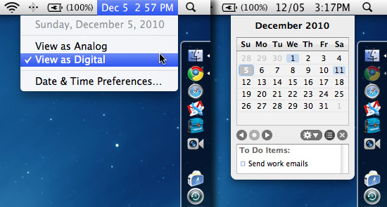
How difficult can it be to add a mini-calendar to the menubar item? This is another feature in Windows that I love, but requires a third party application like MenuCalendarClock for iCal (as seen on the right side of the image above). Notice the word “iCal” in that name? Good, because it needs to have iCal integration, showing me a dot on a date that has an iCal event on it, as well as my ToDo List at the bottom. This would really be a huge boost in productivity – because launching iCal every time I just want to see what day the 23rd of the month falls on is quite annoying!
Moving on to the iPhone, how about you allow me to use all 16 icon slots in iOS folders, rather than the 12 you currently do? Four more icons would make a big difference to me, so obviously the rest of the world benefit as well!
And finally, why is it that we’ve come as far as iOS 4 and I’m still finding apps that don’t allow you to rotate the phone to get a landscape keyboard? I’m speaking about apps like Foursquare, among many others. For cryin’ out loud, what is the freakin’ hold up? I know, the app-maker has to code it in the app, right? Why not just get rid of the vertical keyboard completely, since we all know nobody uses it anyway.
So there you are, my wish list for Mac OS X 10.7. I’m sure you can get them all done, it shouldn’t take more than an hour or two, right?

4 COMMENTS
Love the idea of a sliding Dashboard. Dashboard contains lots of useful apps, all of which go unused launching the app takes over your entire screen.
If Apple don’t do it, maybe a third party app might?
As far as competing with Windows 7, I can’t imagine thats on Apple’s radar. Instead I imagine they will moving towards an iOS model, if the recent preview of OS 10.7 was anything to go by..
I could pretty much care less about most of this. I haven’t burned a cd in about 6 mos. I use a 27″ and 24″ display so spaces is useless. Widgets doesn’t bother me and most of all, I HATE the landscape keyboard and use the vertical keyboard almost exclusively. The only exception is when I’m laying down.
The one most useful feature I would love to see implemented is add in an app icon over the top of windows in expose. With safari possibly showing the same image as the project I’m working on in Photoshop or cocerflow in pathfinder and iTunes it’s easy to get lost and pick the wrong window.
If anything, you would think Apple could keep us “logged in” to password entry after the first one that has been asked for. Like if we are installing more than one app. Have the system ask for your name and password for the first install. Then, for the installs that follow the first one, not have the system ask for your name and password because we just put it in. That would be nice.
The Dashboard, Spaces, and mini calendar suggestions would be nice. I have to switch to iCal quite a few times during the day, it is a pain. I don’t use Dashboard much due to its taking over the whole display. It’s not easy to keep track of constantly changing widgets, it would be nice at a glance, and with the widescreen displays many people now have it wouldn’t get in the way. Spaces indeed needs some refinement. They have barely touched it since its inception.
Disc burning could use some enhancement, like a simple real world choice between burning formats, Mac only, ISO 9660, etc. It doesn’t make a full copy when burning anymore though, it just makes an alias to the file. They stopped that with 10.4 I think, if not 10.3. Toast takes a long time for its Write-out which actually makes the total burn time longer, but Toast does verify about 25% or so faster. On a full DVD that’s around 3 minutes or so quicker, not sure why, my guess is the Finder is the bottleneck there.
But the password thing, I doubt we’ll ever see that. I can see being able to shut it off for a set amount of time, that would be handy. An hour maybe, enough time to get through for example an Adobe updating session that asks you for a password for every single update you’ve just requested to do, but as far as having the option to totally turn it off, I don’t think it’s a good idea. How often do you install things anyway? It’s not like it’s an all day every day occurrence. For me it’s not anyway and I like to play with the new whiz bang things.
Comments are closed.