Get beautiful paragraphs with InDesign’s Optical Margin Alignment
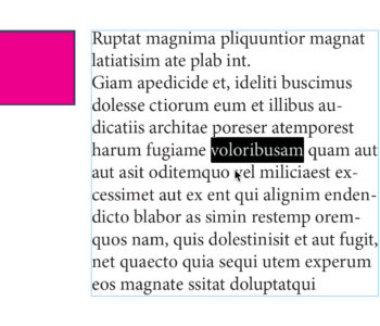
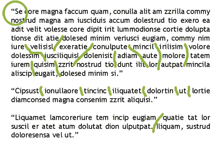
One of the many things designers dread about working with paragraphs of justified type is what we call rivers (gaps inbetween words or letters so large that when it appears on every line in a paragraph it looks like a river going down through your paragraph). Of course you can kern your way through this mess, line by line – and if you use Quark XPress, that’s all you can do. That’s because Quark implements what is called a single-line composer method. This means that Quark looks at one line at a time in a paragraph and decides how to best break the line and adjust the word spacing. Unfortunately, this simply is of little use because if you have to go back and add a word or two, you end up having to re-kern the entire paragraph again. One of the many beauties of Adobe InDesign is the multi-line composer and optical margin alignment features. The multi-line composer feature in Adobe InDesign looks at an entire paragraph of justified text, rather than one line at a time, and decides how to best break each line. For instance, if you add a word or two in the middle of the last sentance of a paragraph, Quark would only kern that last sentance or line, while InDesign looks at the entire paragraph and may even make new line breaks in the first few lines of the paragraph if necessary – which gives you a wonderful, relatively river-free paragraph of text. Then when you turn on Optical Margin Alignment in the Story palette, you are treated to automatic letter and punctuation hanging. This means that letters and punctuation which fall at the first or last character one each line are adjusted so that they hang outside of the text box. In the example below, you can see where the punctuation and the “r” hang over the text box just a little bit, visually making the text look truly “blocked” or justified. Notice also that there are no “rivers” in the paragraphs. 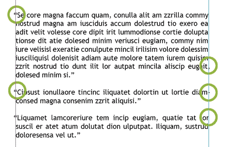 Now lets look at Quark’s composition. I took the same exact paragraph, same font & type size and the same text box width and placed it in Quark, and the results are quite different. In the graphic below, you not only see that punctuation and letters aren’t hanging (which gives the first line of each paragraph a sudo-indent appearance that looks like hell), but the line breaks aren’t that great and the kerning is horrid, creating “rivers” all over the place.
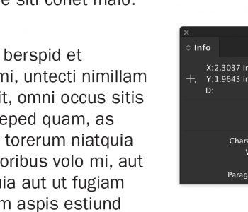
  While margin alignment and multi-line composing won’t do much for you when working with headlines and single lines of text in ads, it can make all the difference in the world when working with newsletters, magazine editorial, brochures and ads that do contain a paragraph of text or two. To turn on Optical Margin Alignment for every InDesign document you create, close all files and open the Story Palette found under the Type menu and click the Optical Margin Alignment check box. Clicking the check box with a document open will only turn it on for that document.
