Cool Web site: Erik Otten
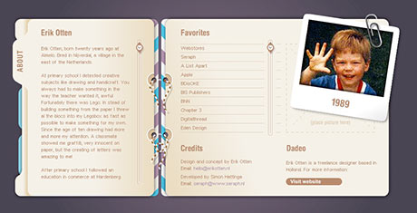 As a rule, I don’t like the use of Flash for the entire Web site. I think it’s overkill, and it usually means that someone is trying to overcome their lack of creativity with bells & whistles. But every once in a while, I come across a site that is done completely in Flash, is creative and easy to navigate. Erik Otten has such a site. It’s his personal Web portfolio of design work that he’s done from his home in the Netherlands. I particularly like the Flash pre-loader graphic of the pencil scribbling progress bar. Very clever. Once loaded, the tabs on the left take you to the various sections of his site, and a scroll wheel appears on the right when there is more to read. Give it a quick once-over, it may provide some inspiration.


