Best and worst logo redesigns of 2010
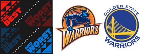
I’m not sure how I missed the annual Best/Worst Of post at BrandNew, but it’s always worth checking out. This year’s crop of corporate brand redesigns has me baffled. Some of the logos listed in the Worst category I found to be pretty decent – such as the Super Bowl XLV logo. On the other hand, a few listed in the Best category couldn’t be worse, in my opinion – like the MySpace logo.




2 COMMENTS
And the design criteria they used for judging these was…?
Are you familiar with the site?
Comments are closed.