My friend couldn’t for the the life of him figure out why you would want or need the feature in a page layout application.
Forgetting the fact that I prefer to think of InDesign as more than a “page layout” application, I offered him the first suggestion that appeared in my mental rolodex of uses for the feature. Expecting the standard “magazine foldouts” reason, my rather un-sexy answer surprised him. Having multiple page sizes in a single InDesign document is a great file management tool.
That’s right. Plain old, boring, un-sexy file management.
For years Freehand users laughed at us Adobe Illustrator freaks because we didn’t have a multiple-artboard feature. When Adobe finally added it in CS4, I immediately found a simple use. Each client I had required me to keep a minimum of 5 copies of their logo. A full color (CMYK), black, white (for reversed out use), grayscale mix, and a Pantone spot color version. That was five files to manage; a real pain in the butt. With multiple artboards, I could keep all five of the logos in a single Illustrator file.
With InDesign CS5, the same theory comes into play with multiple page sizes in a single document. Except now we’re not talking about logos, we’re talking about entire pieces. Let’s start off with the obvious; how many pieces are in a corporate identity package? At least three, and more likely six to ten if you count multiple color variations.
I have one client who has a full color letterhead, business card and envelope. He uses it for most external use. However he also prints a black & white version of his letterhead and envelopes for mailing invoices to his clients, and sending company info internally such as personal memos and paychecks, etc. For years that meant keeping track of six documents (one set of three for color files, and one set of three for B&W versions).
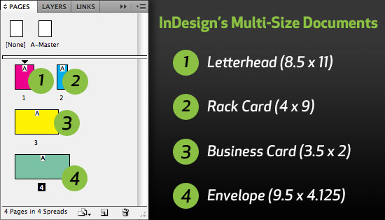
With InDesign’s multiple size page documents, I can keep his entire identity package in a single document. It not only makes it easier to make changes, but it cuts down on the amount of files to manage, and the space it takes up on my hard drive.

InDesign CS5 features multiple page sizes in a single document
If creating corporate identity packages isn’t your cup of tea, perhaps you’ve been known to design a print ad a time or two. Of course you have. And you probably created the exact same ad for several publications, which meant creating a different size ad for each pub. Sure is the sky is blue, the client will want to make a change to the add after you’ve created all those separate ad documents. With InDesign CS5, you can create all the ad sizes in one single document. Again, not only is it easier to make the changes quickly, but you don’t have to come up with a goofy naming scheme to keep track of all the different ads.
If you really think about it, I’m sure you can think of plenty of other ways to use multiple page sizes in a single InDesign document. If for no other reason, it’s a great way to cut down on the amount of files you have to manage for yourself, and your clients.

I think having multiple page sizes is a must!! It will keep us from having too many files all over the place. I too like David have been waiting far too long for this option. I work in the print industry and clients are always wanting to see a variation of sizes including portrait and landscape proofs of their work, so it is vital to be able to have this option in one file.
This has been a feature I have desired for at least 10 years! Multiple page sizes allows for easy management of files with unusual page requirements, such as books with foldout pages for photos or charts. I recently created a book with a number of foldouts for a client. Revisions, preparing PDF proofs and final art assembly were exercises in file organization. Maintaining a single, comprehensive file would have saved valuable time.
wonderful idea i must say !
We had the multiple logo issue too (CMYK, black, spot etc) but solved in with layers… each logo is on it’s own layer in Illustrator and you simply switch the layers on or off in InDesign to get the logo you want. Plus, since the logos are aligned exactly on top of each other in Illustrator, you don’t need to reposition the linked file when changing the logo from black to CMYK or to spot colours – just click the layer on or off!
Multiple page sizes are good when designing website wireframes that have different page heights. I just ran into this today… the homepage is much shorter than a page with blog posts for example. Multiple page sizes FTW!
Now this is a great idea (the business identity package).
I work with a guy that argues keeping everything in one file in dangerous in that if the file corrupts, you’re out of luck. He must not keep good backups. I like your suggestions.