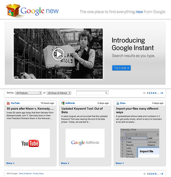
Click the image for Google New: Find out what cool stuff Google is
working on and play with the latest technology they're offering
The in-house graphic designer with a limited number of corporate fonts to use on a daily basis may need nothing more than Apple’s Font Book app (if even that) to manage a small font collection. But the freelance designer with dozens of clients, the ad agency production studio and the print shop with hundreds of clients must have robust font management or dealing with fonts can become a full-time job. For those users, Extensis offers Suitcase Fusion 3.
Infographic design is one of the coolest projects a designer can work on. It allows you a hefty amount of creative freedom, with the advantage of not having to put a lot of emphasis on fitting the design concept into an overall campaign. You can just go to town on the cool factor.
There are entire websites dedicated to showing off infographic samples, and one I came across recently highlighted this Netflix vs. Redbox comparison made by the folks at Redbox. The use of color was an obvious choice, but the simplicity and easy readability was definitely something that attracted me to it.
If you’re looking to add a few colorful and creative pieces to your portfolio, an infographic that is well thought out, both in the data on display and the design used to communicate it, can make for a powerful showpiece.
There are plenty of stock photography sites out there, and while many of them are expensive, more and more of them offer some great, affordable images to use in your designs. But before you decide on your image, be sure to read through this post at DesignShack titled 10 pitfalls to avoid when using stock photos.

The handshake - perhaps the most overused design cliché of all time
The article covers topics such as avoiding cliché and overused photos, creating bad clipping paths, and avoiding obviously posed photos.
Perhaps the most important piece of advice offered is to shoot the images yourself. A decent DSLR camera can be had for $500 nowadays, and can produce stunning images in the right hands. Beef-up on your photography skills by reading through the great photography tips and reviews at Digital Photography School, or subscribe to a photography podcast such as Daily Photo Tips with Chris.
Regardless if you choose to buy stock photos or shoot them yourself, be sure to make good choices when selecting images for your designs.
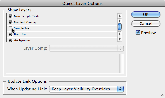
I generally only save image files as layered PSD files, it saves space on my hard drive and a load of time when making edits. Another advantage is that you can control which layers show up after you place them in your Adobe InDesign document.
Once you place your PSD file in your InDesign document, select it and choose Object>Object Layer Options… In the dialog box that comes up you’ll see a list of the layers in the placed PSD file. You can simply click the icon next to the layer name to turn it on and off.

InDesign's Object Layer Options dialog box
If you choose, you can check the Preview checkbox to have the preview image show the changes. I generally leave Previews off because it slows down InDesign tremendously – especially with large layered files. It’s extremely helpful if you name your layers in Photoshop so you know what they are after you place the PSD in your InDesign document.