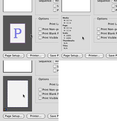
 InDesign has a nifty feature built-in to the Print dialog box. The page proxy box in the bottom left corner of the dialog box can show you page dimensions and scaling info, as well as page offset, gap, image direction and more. Simply click on the page proxy to run through the different previews you see in the image at the right. Of course this isn’t a goldmine of super-valuable information, but it can come in handy, especially for those who do a lot of printing on in-house high-end printers. Often times I hit print, make all my settings and then forget the page size of my document and have to exit the Print dialog just to check the size of the document to make sure it will print without scaling, etc.
InDesign’s Print dialog secrets
Create a 3D wireframe effect using the 3D tool in Illustrator
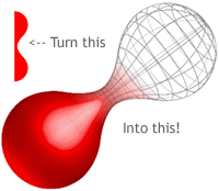 A wireframe effect outlines the countours of an object but leaves each surface transparent – see the image at the right. Creating these effects usually involves a 3D modeling program. Adobe Illustrator has changed that with its 3D effects tool. You can reduce any 3D object you create to a wireframed object, and it’s not as difficult as you might think. Matt Kloskowski has a fantastic tutorial on how to create a 3D wireframe effect at IllustratorWorld. You
Moving facing pages to get rid of the orphan first & last page in Adobe InDesign
![]() A reader recently contacted me with an issue he was facing with regards to a booklet he was working on that was setup as Facing Pages in document setup. His issue was that in his 8-page document, page 1 and page 8 stood alone as single pages, while 2-7 were spreads. Whatever he tried, he couldn’t move page 8 in the Pages panel to the left of page 1 where it would appear when printed. This makes it quite difficult to print mockups, or create crossover images on the front and back cover.
A reader recently contacted me with an issue he was facing with regards to a booklet he was working on that was setup as Facing Pages in document setup. His issue was that in his 8-page document, page 1 and page 8 stood alone as single pages, while 2-7 were spreads. Whatever he tried, he couldn’t move page 8 in the Pages panel to the left of page 1 where it would appear when printed. This makes it quite difficult to print mockups, or create crossover images on the front and back cover. 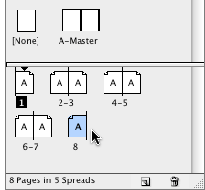 While this behavior is “normal” for InDesign (and Quark) and is no problem for commercial printing, some people simply want to see it on screen as it will appear when printed. Thankfully, there’s an easy way to “fix” this issue. With the 8-page document open and set to facing pages, your Pages panel will look like the image to the right. Page 1 stands alone, 2-7 are spreads, and page 8 stands alone. To make a mockup on your own printer, you want page 8 to appear just to the left of page 1 – which will allow you to stick pages 8/1 to the back of pages 2/7 and pages 3/4 to the back of pages 5/6, fold them in half and put them together just as they would appear when printed. Simply moving the pages as is will do nothing but change the page order in your document, but leave page 1 and page 8 as stand alone pages. Not exactly what you’re looking to do.
 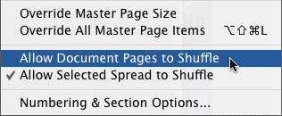 To fix the problem, simply uncheck the Allow Pages to Shuffle item in the Pages panel flyout menu as seen above.
 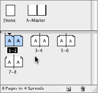 With that done, you can now selectively move pages 1 and/or 8 (or whatever the first and last page numbers are in your document) to their rightful place in the Page order to allow you to print them the way you want (see the image at left). The hitch? You’re probably going to have to adjust the auto page numbering options if you have your pages set to auto-number. But this is a simple task and can make life easier when printing proofs. While I explained to the reader why this InDesign feature works the way it does, I completely forgot to tell him how he can get around it. Hopefully he’s still reading here and will find the solution he was looking for. Sorry man, my bad!
Create a new layer BELOW the current one in InDesign
![]() Many times when you’re working with multiple-layered documents in Adobe InDesign (you did know there are layers in InDesign, right?) you find yourself creating a layer and immediately moving it beneath the current layer you’re working on. It’s tedious work constantly moving the newly created layer down in the list of the Layers panel. You can easily create a new layer and have it appear BELOW the currently active layer by holding the Command + Option keys down while you click the New Layer button in the Layers panel. This tip works in CS2 and CS3, by the way.
Many times when you’re working with multiple-layered documents in Adobe InDesign (you did know there are layers in InDesign, right?) you find yourself creating a layer and immediately moving it beneath the current layer you’re working on. It’s tedious work constantly moving the newly created layer down in the list of the Layers panel. You can easily create a new layer and have it appear BELOW the currently active layer by holding the Command + Option keys down while you click the New Layer button in the Layers panel. This tip works in CS2 and CS3, by the way.
Save time and space with InDesign Workspaces
![]() If you’re the type who likes to have their InDesign panels in a certain spot all the time, or like to have certain panels open for certain types of projects, you simply must take advantage of Workspaces. Workspaces allows you to save your panel locations for use at any time. To save your Workspace, set your panels up the way you like them, then go to Window>Workspace>Save Workspace… Name your workspace when prompted. That’s it. To test it, move your panels around, close some, open some others. Then go back to Window>Workspace and select the Workspace you just named from the list. Your panels should all snap back to where they were when you saved. You can set up multiple Workspaces. I have one for when I’m working on text heavy documents in which I have most of the text-related panels like text wrap, story, character, styles, etc. open. Then I have another one for “all-around use” which have totally different panel locations. If you work on multiple computers, you can bring your Workspace with you, though it’s not quite as easy as it should be. To bring your Workspace with you, navigate in the Finder to: Users/YourUserName/Library/Preferences/Adobe InDesign/Version 5/ Workspaces. If you’re still running CS2, the path is the same except substitute Version 4 for Version 5 in the file path. In that folder you’ll see an XML file named after the Workspaces you’ve saved. Simply burn it to CD or email it to your other computer and place it in the same folder on that computer. Workspaces aren’t exclusive to InDesign. All the Adobe Creative Suite 3 applications have them, and work in much the same way. Photoshop goes a few steps further in that it also allows you to save any custom keyboard shortcuts and menu customizations you’ve made in the Workspace as well.
If you’re the type who likes to have their InDesign panels in a certain spot all the time, or like to have certain panels open for certain types of projects, you simply must take advantage of Workspaces. Workspaces allows you to save your panel locations for use at any time. To save your Workspace, set your panels up the way you like them, then go to Window>Workspace>Save Workspace… Name your workspace when prompted. That’s it. To test it, move your panels around, close some, open some others. Then go back to Window>Workspace and select the Workspace you just named from the list. Your panels should all snap back to where they were when you saved. You can set up multiple Workspaces. I have one for when I’m working on text heavy documents in which I have most of the text-related panels like text wrap, story, character, styles, etc. open. Then I have another one for “all-around use” which have totally different panel locations. If you work on multiple computers, you can bring your Workspace with you, though it’s not quite as easy as it should be. To bring your Workspace with you, navigate in the Finder to: Users/YourUserName/Library/Preferences/Adobe InDesign/Version 5/ Workspaces. If you’re still running CS2, the path is the same except substitute Version 4 for Version 5 in the file path. In that folder you’ll see an XML file named after the Workspaces you’ve saved. Simply burn it to CD or email it to your other computer and place it in the same folder on that computer. Workspaces aren’t exclusive to InDesign. All the Adobe Creative Suite 3 applications have them, and work in much the same way. Photoshop goes a few steps further in that it also allows you to save any custom keyboard shortcuts and menu customizations you’ve made in the Workspace as well.
Using Kuler with Illustrator
If you’ve recently upgraded to Adobe Illustrator CS3, you may be slightly confused with all the new color options available to you. In this video at Layers Magazine, Dave Cross shows you how to use Adobe’s interactive Kuler to export color swatches to Illustrator.
How to use the InDesign gradient feather tool
 With InDesign CS3 came yet another useful tool that prevents the need to switch to Photoshop to alter an image you’re using in your page layout. It’s called Gradient Feather, and you can find it under the normal Gradient tool in the InDesign Tools panel. Of course adding transparency to your image directly in Adobe InDesign is nothing new. If you recall, InDesign CS2 offered a simple feather feature to your images, but in a limiting manner in which the feather applied to all sides of the image at once. Not very useful in my opinion.
  With CS3, we can now select the image in our layout with the direct selection tool, then select the Gradient Feather tool by either clicking and holding the Gradient tool in the Tools panel and selecting the Gradient Feather from the flyout menu, or simply hitting Shift + G. Now all you have to do is click and drag over your image as you would to apply a normal gradient and you’re good to go – see the quick results in the animated gif image to the right.


Good designers copy, great designers steal
Pablo Picasso, the first living artist to be featured in the Louvre, influenced the artistic world in a uniquely original way. So why is he known for saying “Good artists copy, great artists steal?”
Cameron Moll, a freelance new media and print designer, wrote an article a few years back on the topic, but I find it still relevant today. Stop by SitePoint and take a look at Good designers copy, great designers steal.