 You wouldn’t think that making gradients in Photoshop as a skill, but let me tell you that it’s quite easy to see the difference between a good gradient and a great one. In the sample above you’ll notice the lack of saturation and harshness in the “good” and “better” gradients and how natural and realistic the “best” gradient appears. 9rules Network’s Mike Rundle has a Gradient Tutorial to help you make more realistic, vibrant gradients.
Getting better gradients in Photoshop
Fixing the “bold type” problem in InDesign
![]() If you’ve run into a problem where Adobe InDesign either prints, or exports as PDF, your document and some type is appearing bold when it shouldn’t be, there’s a simple explanation and solution. The problem is that you most likely have some form of transparency working on top of the type that is being affected. Many times it’s either a .psd file with a transparent background or an object with a drop shadow applied to it that is overlapping a box of text. During the flattening process, the type gets rasterized or outlined and this is what causes the “bold effect.” To avoid the problem, make sure that you either move the text on TOP of the object with the transparency, or better yet, put all your type on its own layer and move the layer to the topmost level in the Layers palette.
If you’ve run into a problem where Adobe InDesign either prints, or exports as PDF, your document and some type is appearing bold when it shouldn’t be, there’s a simple explanation and solution. The problem is that you most likely have some form of transparency working on top of the type that is being affected. Many times it’s either a .psd file with a transparent background or an object with a drop shadow applied to it that is overlapping a box of text. During the flattening process, the type gets rasterized or outlined and this is what causes the “bold effect.” To avoid the problem, make sure that you either move the text on TOP of the object with the transparency, or better yet, put all your type on its own layer and move the layer to the topmost level in the Layers palette.
Adobe Illustrator file formats explained
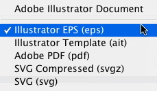
 When you save files from Illustrator, the three main choices you have for print production work are Adobe Illustrator Document (.ai), Illustrator EPS (.eps), and Adobe PDF (.pdf). The following is a brief rundown of the formats you can choose to save your files as when using Illustrator. Adobe Illustrator Document (.ai) This is Adobe’s native Illustrator format, and only Illustrator is able to read this file format. The data contained in the file is based on PDF, but it isn’t a format that Acrobat can read correctly. When saving in .ai format, you retain all your editability and transparency in your file. When you save your file as an .ai file, Illustrator includes a PDF 1.4 composite preview inside the file in an unflattened form. The .ai format is the best format to save your file as for internal use while you’re still working on the file, as well as for placing into Photoshop or InDesign. The .ai format is my preferred method for saving files, as I use InDesign for my page layout. However if you use Quark XPress, you’ll have to stick with the older .eps format explained below. Illustrator EPS (.eps) This long-standing file format, which is short for Encapsulated PostScript, is supported by most all standard graphics applications. Unfortunately, .eps files do not support transparency, so files you create that contain transparency are “flattened” so other programs can import them. When you save as an .eps, most effects are expanded and text may or may not be broken apart in order to flatten the file – however Illustrator saves a copy of the file in .ai format inside the .eps file so that you can edit the file later in Illustrator if you wish. The .eps format has been widely used as the “standard” file format for saving artwork to be used for print production work with Quark XPress for many years, but recently began loosing love from users due to its large file size and lack of support for transparency. Personally, I no longer use the .eps format. Since the introduction of InDesign and Smart Objects in Photoshop, I find the .ai format for flexible and the file sizes more manageable. Adobe PDF (.pdf) We all know what a PDF is. When you save a file from Illustrator as a .pdf file, Illustrator saves the data so that any PDF reader can understand and display the file. Thankfully, Illustrator saves a copy of the file in native .ai format inside the PDF file which is unflattened for later editing – as long as you remember to leave the Preserve Illustrator Editing Capabilities checkbox ticked as it is as a default. If you uncheck that box, the file size is drastically reduced, but so are your options for editing the file later. Text will be virtually uneditable, effects are flattened, etc. I generally don’t recommend saving your files as PDFs from Illustrator. Illustrator Template (.ait) This format is exactly what it says. It’s a template format for Illustrator that allows you to save your file as a template for using as a “building block” for later files. SVG Compressed (.svgz) and SVG (.svg) SVG stands for Scalable Vector Graphics and is an XML markup language for describing two-dimensional vector graphics, both static and animated and is an open standard created by the World Wide Web Consortium. The SVG format can contain vector shapes and paths, raster graphics (images) and text. The SVG format is mostly used for Web-based work, and is beyond the scope of this article, so I won’t bother to go into it here. Export options Illustrator also allows you to “export” your file to nearly a dozen other formats (which also means it can read them) such as .jpg, .png, .swf (Flash), .bmp, .tif, .txt (text format), .wmv (Windows meta file) and .dxf (AutoCAD Interchange Format). Overall, Illustrator has a lot of flexibility in the formats it saves as, allowing you to maximize the file use in other applications.
InDesign shortcuts for scaling, shearing and rotation
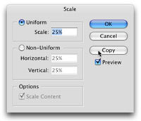
Did you know that you can Option + Click an object with the Rotation tool in Adobe InDesign to bring up the Rotation dialog box? You can also hit Option + Click with the Shear tool to bring up the Shear dialog box.  And for scaling you have an added option of Option + Clicking with the Scale tool and not only bringing up the Scale dialog box, but in that dialog you have the ability to automatically make a copy of the object and scale that, rather than the original. And don’t forget, InDesign uses the spot you Option + Click as the reference point for these options. So for instance, if you Option + Click on the bottom right selection handle of an object with the scale tool, InDesign keeps the bottom right of the object where it is and scales from all sides down or up from there.
Work in RGB, view in CMYK
One thing I believe helps me get the results I see on screen when a job is printed is to work in the CMYK color space to begin with when starting a design job that includes images. Before I start adding or changing color or adding elements, I’ll switch to CMYK Preview mode in Photoshop. This gives me the added bonus of being able to use all of Photoshop’s editing and filter features that are only available in RGB mode. By doing this, I know what my image is going to look like when it’s converted to CMYK before printing. If you forget to switch to CMYK, or at least use the CMYK Preview mode, you run the risk of falling in love with the beautiful vivid color in your image, only to see it washed out and flat when printed.
Changing your brush in Photoshop
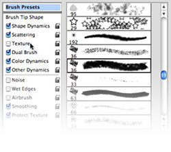
 When you’re working with the brush tool in Photoshop there are a lot of shortcuts to make it a bit easier on you. The following shortcuts assume you already have the brush tool active. You can jump from one brush to another in the brush list simply by using the Arrow keys on your keyboard. Once you have a brush you like active, you can make the selected brush larger or smaller by using the Left [ and Right ] Bracket keys. If you have the Brushes drop down menu from the Control palette open, you can have it automatically close when you select your brush simply by double clicking the sized brush you want. This ONLY works in the Control Bar drop down menu, not the palette. Once you have your brush selected, you can use it to paint a straight line by holding down the Shift key. And if you really want to get some cool effects with your brush, go to your brushes palette and select your brush, then turn on or off some of the Dynamic Brush settings (the check boxes to the left of the brush.
Photoshop’s Layer Mask in brief
 When working with layer masks in Photoshop, you start out with black as the color that hides and white as the color that reveals. To switch these without using the Toolbox to set your foreground color, press the X key on the keyboard to toggle the painting color between black and white.


Working with a copywriter: an interview
One of the misconceptions many new designers have when they start out in an ad agency is that they will work alone in a plush office taking client supplied copy and photos and designing the next great ad. In reality, you’ll be working as a team with a copywriter tossing ideas back & forth about the text for the ad, as well as the overall design. That’s because any great ad has to speak to a viewer with words and pictures, at least most do. Some ads are pure text and can be quite successful and creative. Others offer only a word or two with a stunning visual to get the message across, such as Apple’s “Think Different” campaign. At first it can be difficult learning to “share” the design process for someone used to freelancing or working for a firm with an in-house design shop. Working with a copywriter doesn’t mean you won’t have to write copy, it also doesn’t mean you’ll have 100% control over the design. In order to shed some light on the subject, I asked former R&R Partners Senior Copywriter, Steve Yamamori, for some brief but helpful insight. Steve has worked with clients such as Cox Communications, YMCA, Blue Cross Blue Shield of Arizona, National Bank of Arizona, Anti-Tobacco, Las Vegas Convention & Visitors Authority, Valley Metro and several non-profit clients. He’s also an Emmy and Addy Award-winning copywriter, so he knows his stuff! CG: Steve, tell us how you got into the ad business?
CG. What is your role in the creative process?
CG: That’s a bit one-sided, don’t you think? Is working with a copywriter that important?
CG: Any other profound statements for the readers, Steve?