To select objects hidden behind other objects or simply below a larger object, Command + Click until the object you want is selected. Each click selects the object below the previous top object. When you reach the object you want, you can move the object by dragging it while the mouse button is still held down, or drag it from the object’s center point. This is a handy tip, but I’ve found it easier, and more beneficial to make heavy use of Layers. I put text on one layer, borders on another, photos on yet another… it makes it MUCH easier to change things later if I need to.
![]() Following up on the previous tip on how to free up RAM in Photoshop, if you work in Adobe InDesign all day like I do, you may notice that it gets very sluggish after a few hours. You’ll be doing yourself a huge favor if you simply quit InDesign every once in a while and re-launch it. InDesign will fly along at full speed once you do. The problem is that InDesign suffers from some sort of “memory leak” and it slowly but surely keeps things stored in RAM that it should have purged by itself. Over time, this leads to a slow down that is especially noticeable when scrolling pages with images, scaling images, etc… Quit and relaunch and the RAM gets set free!
Following up on the previous tip on how to free up RAM in Photoshop, if you work in Adobe InDesign all day like I do, you may notice that it gets very sluggish after a few hours. You’ll be doing yourself a huge favor if you simply quit InDesign every once in a while and re-launch it. InDesign will fly along at full speed once you do. The problem is that InDesign suffers from some sort of “memory leak” and it slowly but surely keeps things stored in RAM that it should have purged by itself. Over time, this leads to a slow down that is especially noticeable when scrolling pages with images, scaling images, etc… Quit and relaunch and the RAM gets set free!
One of the many things designers dread about working with paragraphs of justified type is what we call rivers (gaps inbetween words or letters so large that when it appears on every line in a paragraph it looks like a river going down through your paragraph). Of course you can kern your way through this mess, line by line – and if you use Quark XPress, that’s all you can do. That’s because Quark implements what is called a single-line composer method. This means that Quark looks at one line at a time in a paragraph and decides how to best break the line and adjust the word spacing. Unfortunately, this simply is of little use because if you have to go back and add a word or two, you end up having to re-kern the entire paragraph again. One of the many beauties of Adobe InDesign is the multi-line composer and optical margin alignment features. The multi-line composer feature in Adobe InDesign looks at an entire paragraph of justified text, rather than one line at a time, and decides how to best break each line. For instance, if you add a word or two in the middle of the last sentance of a paragraph, Quark would only kern that last sentance or line, while InDesign looks at the entire paragraph and may even make new line breaks in the first few lines of the paragraph if necessary – which gives you a wonderful, relatively river-free paragraph of text. Then when you turn on Optical Margin Alignment in the Story palette, you are treated to automatic letter and punctuation hanging. This means that letters and punctuation which fall at the first or last character one each line are adjusted so that they hang outside of the text box. In the example below, you can see where the punctuation and the “r” hang over the text box just a little bit, visually making the text look truly “blocked” or justified. Notice also that there are no “rivers” in the paragraphs. 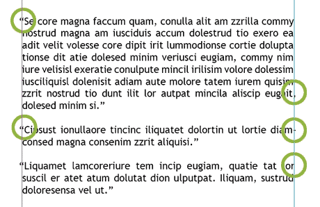 Now lets look at Quark’s composition. I took the same exact paragraph, same font & type size and the same text box width and placed it in Quark, and the results are quite different. In the graphic below, you not only see that punctuation and letters aren’t hanging (which gives the first line of each paragraph a sudo-indent appearance that looks like hell), but the line breaks aren’t that great and the kerning is horrid, creating “rivers” all over the place.
 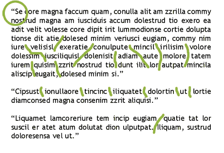 While margin alignment and multi-line composing won’t do much for you when working with headlines and single lines of text in ads, it can make all the difference in the world when working with newsletters, magazine editorial, brochures and ads that do contain a paragraph of text or two. To turn on Optical Margin Alignment for every InDesign document you create, close all files and open the Story Palette found under the Type menu and click the Optical Margin Alignment check box. Clicking the check box with a document open will only turn it on for that document.
![]() Every once in a while, when you’re working on a large file in Photoshop, you might want to make a trip to Edit>Purge>All – which will free up a LOT of memory. Photoshop stores your history and the clipboard in memory – which takes up quite a bit of space depending on how you work. You may also wish to experiment with lowering the amount of steps that Photoshop saves in your history palette by making a visit to the preferences. The more steps saved, the more RAM used.
Every once in a while, when you’re working on a large file in Photoshop, you might want to make a trip to Edit>Purge>All – which will free up a LOT of memory. Photoshop stores your history and the clipboard in memory – which takes up quite a bit of space depending on how you work. You may also wish to experiment with lowering the amount of steps that Photoshop saves in your history palette by making a visit to the preferences. The more steps saved, the more RAM used.
An annoying fact when designing in Photoshop is that you quickly accumulate a multitude of layers. Even with Photoshop’s advancements in the layers arena, it gets out of hand quickly. The best thing you can do is delete unused layers. A quick way to delete multiple layers in Adobe Photoshop is to Shift+click or Command+Click the layers you don’t want, then click on the Layer Palette Trash icon. Don’t forget that you can save a Layer Comp before you delete the layers, that way you can quickly return them if necessary.
You may know that Quark has a “Library” palette that allows you to store objects for future use. But did you know that InDesign has one as well? 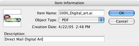 To use it, go to File>New>Library. Then, place an image or text block on the page and keep it selected. Then click the New Library Item button in the Library palette (it looks like a page icon at the bottom). You can click the “i” icon to add descriptive information to each image as well.
 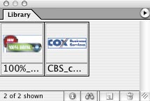 Once you store an object in the Library palette – the object is always available in every document. Better yet, the object retains its scaling attributes and its place on the page – perfect for newletter mastheads, etc. Then whenever you need one of the objects in the Library, you simply choose Place Items from the palette flyout menu. This may seem like a frivolous feature, given that you could just cut and paste in place from other files if you happen to have them open. But think about all the time you spend navigating in the Place dialog box just getting to the folder that contains the artwork… the time savings adds up quickly by using the Library.
 Life In Vector has a great tutorial on using the Gradient Mesh tool in Adobe Illustrator. It’s available on the download page, and is about a 1.3MB PDF file. You can also view some of the fantastic illustrations, like the car above, done completely in Illustrator.
For the most part, any site with Flash is a site I don’t like to frequently visit. I find all-Flash sites to be about as annoying as it can get. There’s really no reason to do it, other than the fact that “you can.”  Every once in a while though, I come across a site that doesn’t go overboard with animation, even though the site is done completely in Flash. Check out the Tonik Health site by Blue Cross of California. It’s a great example of a Flash site that’s NOT used for Evil!


