One of the most confusing things to do with Illustrator for new users is working with Compound Paths, which are responsible for taking two solid objects and combining them to make one of the objects a “hole” in the other. Let’s say you want to make a donut. You first draw a larger circle, then draw a second smaller circle over the first one which will be the hole. Now, simply select the objects and go to Object>Compound Path>Make. That’s it.
Convert images to gray in a PDF
Save your sanity, use CMYK Preview in Photoshop
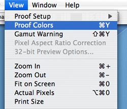
 I’m always amazed to see some print designers working in the RGB color space. It’s like a mechanic working on a car in the dark, you just don’t know what you’ll get when he’s done. Many filters and some color correction features only work in the RGB color space, but that doesn’t mean you have to “fly blind.” Try hitting Command + Y or select View>Proof Colors from the menu bar to see what your image will look like when converted to CMYK using your particular color settings. Many times, it will drastically alter your expectations and the results of your color edits. It will also allow you to continue using those filters and edits for color – and still know what you’ll get when you’re all done.
Creating “dirty type” in Illustrator
When you’re working in Illustrator and you want a little “rougher/hand-drawn look” to your type, try converting the type to outlines then convert your stroke to an outline as well.  First, make sure your type has a stroke applied. Then select your type with the Arrow tool, go to Type>Create Outlines (or Command + Shift + O). Then, go to Object>Path>Outline Stroke. This will essentially make the stroke of the type a different object completely. Now comes the fun part. Use the Direct Select tool (the white arrow tool) to select the stroke outlines and move them however you wish. You can achieve even better effects by grabbing the bezier handles and stretching them. For even more effect, you can go to Filter>Distort>Roughen and use very small amounts in the dialog input boxes to achieve greater “hand drawn” appearance.
Jumping pages when using InDesign page sections
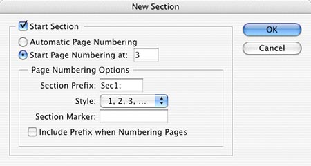
In this previous tip I reminded you that hitting Command + J and typing a page number and Enter will take you to that page. But in the event that you have special page number options set, it won’t work without a little more effort. Lets say you have an 8 page booklet you’re working on in Adobe InDesign and you want the page numbers to start on document page 3 (because document page 1 is the cover and page 2 is the inside cover). You would right (Control) click on document page 3 in the Pages palette and select Numbering & Section Options and click the Start Numbering Pages At button and type “3”. This now makes document page 3 be page number 1.  The problem is that now when you hit Command + J to jump to a page, you can’t because you’re using Section options. The way around it is to use the standard Command + J, but instead of typing just “3” you must use +3 instead. The + (plus key) tells ID that you want to go to the absolute document page 3… which is actually page 1 in your page numbering scheme. This is somewhat confusing, and quite frankly, I find it very unintuitive, but once you get used to doing it, it’s still faster than going to the pages palette and scrolling through a long document to get to the page you want.
Sharpening an image in Photoshop
Most images in Photoshop need sharpening when you reduce them, or importing from a scanner or digital camera. There are two ways (which generally provide the same results) that you may find useful.
- Change the image into Lab Mode and only sharpen the Luminosity Channel is one way.
- Another way is to choose Filter>Sharpen>Unsharp Mask, apply the settings that you want, then choose Edit>Fade Unsharp Mask, and alter the Blend Mode to Luminosity. The benefit of this method is that you can adjust the amount of the sharpening while you’re there instead of undoing and trying again.
There are, of course, other methods to accomplish the same thing, this is just an idea. If you have another way, please share it in the comments!
Create global PDF settings in Adobe apps
Review: Check Off 3.2
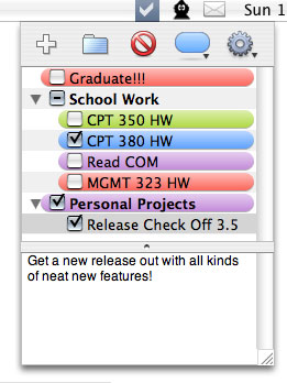
Every once in a while, you come across an application or utility that does very little, so little in fact that most people overlook it as trivial. But I like apps that do very little. It usually means they do them extremely well – it also means they tend to be affordable, if not outright cheap!  I found myself in need of a “To-Do List” app for OSX. Now obviously I could just use stickies, but really, it’s more trouble than it’s worth and isn’t very handy. I also tried some To-Do-List type apps, but found that they were so far overkill that I got dizzy just looking at them. Entourage is a no-go because I don’t use it. Konfabulator has a nice simple To-Do list widget, unfortunately it not only costs $25 to use, but you’re stuck running a memory hog of a program just to have the list. iCal has one, but again, it’s a lot of effort. Enter Check Off. Check Off from Carpeaqua Software is a menu bar application that lists To-Do items in a drop down list, including a check box for when you finish the job. As you can see by the snapshot at the right, you can color items, create folders to group items and also type a brief description of each item if you wish. The list box automatically rolls back up into the menu when you click on any other app including the Finder. The preferences are slim, the ability to launch at startup and expand the list menu to fit all items in view are about the only options, but it really doesn’t need anything else. You can also print and export your list as a text file or HTML. The best part is, it’s 100% FREE. I can’t believe that I’ve never heard of this app before, but I can’t tell you how nice it is to see a small Macintosh developer not get caught up in feature-bloat syndrome. If you’re interested in a To-Do List application that knows how to stay out of your way, yet still do its job, I urge you to give this one a shot!
Sizing a frame to fit content in InDesign
![]() When you have content placed in a frame in Adobe InDesign, you can press Command + Option + C to resize the frame to the size of its contents – text or graphics. You can also hit Command + Option + E to stretch a graphic to fill a frame. If you want to keep the graphic scale proportional, add the Shift key. Once your graphics are placed in a content frame and sized to your liking, you can center the graphic in the frame by pressing Command + Shift + E. These commands may seem obvious, because they’re in the menus and in the manual, but I’ve found that many designers and production artists are so used to Quark’s key commands that they forget to learn new ones.
When you have content placed in a frame in Adobe InDesign, you can press Command + Option + C to resize the frame to the size of its contents – text or graphics. You can also hit Command + Option + E to stretch a graphic to fill a frame. If you want to keep the graphic scale proportional, add the Shift key. Once your graphics are placed in a content frame and sized to your liking, you can center the graphic in the frame by pressing Command + Shift + E. These commands may seem obvious, because they’re in the menus and in the manual, but I’ve found that many designers and production artists are so used to Quark’s key commands that they forget to learn new ones.
Automatic right-aligned tabs in InDesign
![]() When you’re in Adobe InDesign and you have a text block that you have carefully set right-aligned tabs for using the tab bar, you’re somewhat stuck with the tab setting if you need to resize the frame. The tab setting stays where it is regardless of any width adjustments you make to the text frame. You can make it much easier on yourself simply by hitting Shift + Tab. This will automatically put the text after the tab to the far right point of the text frame regardless of the width of the text frame. This of course makes it much easier on you if you need to make that frame a bit thinner or wider.
When you’re in Adobe InDesign and you have a text block that you have carefully set right-aligned tabs for using the tab bar, you’re somewhat stuck with the tab setting if you need to resize the frame. The tab setting stays where it is regardless of any width adjustments you make to the text frame. You can make it much easier on yourself simply by hitting Shift + Tab. This will automatically put the text after the tab to the far right point of the text frame regardless of the width of the text frame. This of course makes it much easier on you if you need to make that frame a bit thinner or wider.
