One of the most difficult color adjustments to do is skin. Too much red and you look sunburnt, not enough and your skin takes on a shade of yellow that can only be compared to an infants dirty diaper after eating peas. In the photo below, the handsome devil on the right looks pretty good, but that ugly guy on the left looks like he spent a little too much time in the sun the day before.

Original image with redish skintones
Many times, adjustments made with either Levels or Curves can destroy detail and affect colors you don’t want to change. Here’s another way that isn’t quite as drastic and limits the adjustment only to the colors you want.

First, select the area you want to edit (in this case, the face) and feather the selection a little to create a soft edge. Now, create an
Adjustment Layer using the adjustment layer button at the bottom of the layers palette and select
Hue/Saturation. By using an adjustment layer, we don’t lose the original and don’t have to bother saving the adjustment as a copy. Next, from the drop down menu, select the color you wish to adjust, in this case it’s Red. Now start moving the sliders around and watch the unwanted color disappear. Or if I really WANTED to look sunburned, I could add more red to the already red areas. You can see the results of a slight Red adjustment in the photo below. Notice that only the red areas were affected.

Adjusted skintones
The changes I made were purposely drastic (the skin tone now looks too flat) to show the differences. Obviously, you must look at each image individually and adjust accordingly. The guy on the left is still ugly, but at least he doesn’t look sunburned!


 First, select the area you want to edit (in this case, the face) and feather the selection a little to create a soft edge. Now, create an Adjustment Layer using the adjustment layer button at the bottom of the layers palette and select Hue/Saturation. By using an adjustment layer, we don’t lose the original and don’t have to bother saving the adjustment as a copy. Next, from the drop down menu, select the color you wish to adjust, in this case it’s Red. Now start moving the sliders around and watch the unwanted color disappear. Or if I really WANTED to look sunburned, I could add more red to the already red areas. You can see the results of a slight Red adjustment in the photo below. Notice that only the red areas were affected.
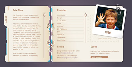
 As a rule, I don’t like the use of Flash for the entire Web site. I think it’s overkill, and it usually means that someone is trying to overcome their lack of creativity with bells & whistles. But every once in a while, I come across a site that is done completely in Flash, is creative and easy to navigate.