Try using the Sponge tool in Adobe Photoshop to reduce the visibility of facial blemishes in a portrait. PhotoshopHelp has a quick tip for using the sponge retouching tool.
How to turn off curly-quotes in Adobe InDesign
Typographers quotes (curly quotes) look great don’t they? InDesign converts all straight quotes to curly quotes by default, but if you want a straight quote, it’s fairly easy to get them. Press Command + Shift + Option + ‘ (that’s the quote key next to Enter on your keyboard). This key combo turns off the quote converter preference. Now your quotes will be straight. If you want to go back to curly quotes, just press the key combo again.
Control the zoom in Adobe InDesign
In Adobe InDesign, if you have an object on the page selected and use the zoom tool, or the keyboard commands to zoom in, ID will automatically zoom with the selected object as the “center point.” Commands for zooming: Command + 5 = 50% Command + 1 = 100% Command + 2 = 200% Command + 0 (zero) = Fit page to window Command + Option + 0 (zero) = Fit entire spread to window Command + Option + 5 and then type a percentag & hit Enter = zoom to the percentage you typed.
How to switch between Photoshop windows
OK, so you’ve known for a long time that Command + Tab switches applications. And you’ve long since figured out that Command + ` (backtick, also known as the ~ key next the number 1 key) will switch between windows of the active application. But have you noticed that it doesn’t work in Photoshop? To switch between open windows in Photoshop, simply use Control + ` (backtick) to switch between windows.
Creating your own distortion envelopes in Adobe Illustrator
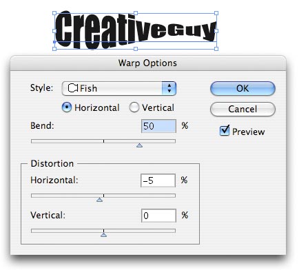 Envelopes are what Adobe Illustrator calls the shapes you use to distort objects. If you don’t know what I’m talking about, go to the Effects>Warp menu when you have an object selected. You can create your own Envelopes and use them on virtually any object in Illustrator other than graphs or guides. Here’s how: Select one or more objects on your page. Now go to the Object>Envelope Distort menu and select a method for distortion from the menu. Once applied, you can continue to the edit the original object, and you can edit, expand or delete the Envelope at any time you desire. The only thing you can’t do is edit an Envelope shape and the object in the Envelope at the same time.
Designing with a solution is the problem
I came across a rather interesting article by Thomas Vanderwhal regarding a long-standing issue with the ad business. The article is titled Designing with a Solution is the Problem, and it covers the ever-present problem of clients asking you to design a solution to a problem they aren’t willing to, or cannot show you (cart before the horse). If you thought design is about making an ad look cool, you obviously have no grasp of the business, and hopefully this article will illustrate this concept for you. Also, be sure to check out the other article Thomas linked to, Be Cooler by Design.
To transform, or to free transform?
If you’ve worked in Photoshop for a short while, you’ve undboutedly come across the Transform tool under the Edit menu. It allows you to scale, skew, rotate and more a selected object or layer. If you find yourself going back to the menu several times to get the object just right, you should consider using Free Transform. 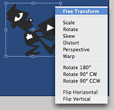 Free Transform ( Command + T ) allows you to allows you access to all the transform options including warp, perspective, distort, skew, rotate and scale, as well as image flipping – all at the same time. No multiple trips to the Edit menu. Once you hit Command + T, simply right click (control + click for one button mouse users) to access the contextual menu to display your options. You can rotate your image a bit, the right click again to add some perspective… all without hitting enter to commit the changes. Hold down the option key to scale from the center of the object, or just grab the handles and hold shift to scale proportionately just like Quark or InDesign. To rotate an object, move your curser just outside the corner handles to change the cursor to a curved cursor allowing you to rotate. Hold down Command + Shift keys and drag a side handle to skew the object. When you’re all done, just hit the Enter key to commit the changes.
How to determine how much scratch disk you need for Photoshop
![]() With changes in Photoshop and its memory management, the formula used in the past (that is, 3-5 times the size of your average image) no longer provides an accurate estimate of how much scratch disk Photoshop needs. In Photoshop CS2, you can use the states in your history palette to help you determine how much scratch disk space you need. Note: I never subscribed to this theory to begin with. My personal choice is to assign about 65% of my RAM to Photoshop, and let Photoshop figure out the scratch disk itself.
With changes in Photoshop and its memory management, the formula used in the past (that is, 3-5 times the size of your average image) no longer provides an accurate estimate of how much scratch disk Photoshop needs. In Photoshop CS2, you can use the states in your history palette to help you determine how much scratch disk space you need. Note: I never subscribed to this theory to begin with. My personal choice is to assign about 65% of my RAM to Photoshop, and let Photoshop figure out the scratch disk itself.  Each history state that includes an operation that affects the entire image (for example, when you apply Gaussian blur or unsharp mask to the entire image) creates a full copy of your image at its original size. If your initial image is 500 KB, and you apply Gaussian blur to it, your image will need 1 MB of scratch space. If your history states consist of operations that affect only part of the image, such as paint strokes, only the size of the tiles touched by the strokes are added to the image size. If you count up the number of histories you have where operations have affected the entire image, and multiply your original image size by that number, you’ll have an approximate amount of scratch disk space the image will need. If you have applied levels, a reduce noise filter, and an unsharp mask filter to your entire image that’s 5 MB in size, the image will need 20 MB of scratch space. If you need to reduce your scratch disk overhead to a minimum, you can minimize the number of patterns and brush tips you use in each as your presets, and you can reduce the number of patterns you use in your image’s Layer Styles (as applied with the Bevel and Emboss Texture or in the Pattern Overlay). Each small pattern and sampled brush in the presets uses at least one tile for storage. Patterns used in Layer Styles take extra RAM, as well.
Font Agent Pro
The following is the first installment of a 3 part series on font management applications. Let me start off by saying that everything said here is coming from a user. I, nor anyone else, received anything in exchange for saying anything good or bad about any particular app. 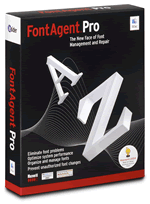 Font Agent Pro (FAP) from Insider Software. I haven’t touched FAP since the OS9 days, so I asked a fellow designer/pre-press operator to write-up his experience with it. His name is Pete Mrsich, and if you recognize the name, you’ve probably seen it listed in the credits of XtraLean’s ImageWell and ShutterBug software as the icon designer. Pete has been a freelance designer and pre-press operator for many years, so he knows the ins-and outs of fonts and their impact on the MacOS in general. I asked Pete to answer a few questions about FAP, and the following are his unedited remarks:
In what type of environment do you use your Mac?
At work, I use my Mac in a pre-press/design environment at a direct-mail publishing company. I work with many different types of files, from Quark 4 to Quark 6.5, Illustrator EPS, Photoshop, PDF, etc. At home, I use my Mac for freelance work, mostly in InDesign but Illustrator & Photoshop as well. Web design too!
What font management apps have you tried, and which one did you settle on using?
When I started in this position, the font app being used for the job was Masterjuggler in OS9, it worked well because everything was rooted in the older operating system, activation & management was fairly easy to handle, and adding new fonts was easy as well. Since migrating to X (started in Jaguar at this job), I’ve tried many different apps, MasterJuggler X, Font Reserve, Suitcase, even attempting an old demo of Adobe Type Manager, since at the time we were using Quark 4.11 via Classic. I finally came across a demo of Font Agent Pro, tried it out for a few days and I pretty much knew this was the app that would do the trick. I had the IT guy register it for me a few weeks later, and I’ve been using it ever since…
Did you switch to Font Agent Pro from another font management app, and if so, why?
I didn’t necessarily HAVE to switch, but once I started working more and more in OSX-native apps, it became clear that the ‘Classic’ version of MasterJuggler wasn’t going to do the job. The X version was fairly unresponsive, auto-activation was maddening, and it just didn’t want to play nice with the new version of Quark.
Font Agent Pro
What are the pros of using Font Agent Pro for font management?
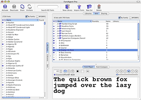
Insider Software has made it frighteningly easy to work in almost all major design apps, and have FAP manage fonts very well in all of them. When I first started working with FAP (version 1), I was using Quark 4.11 via Classic but also some OSX-native apps at the same time (Photoshop, some ID, etc), FAP handled the mixed environment beautifully. When I upgraded to version 2 the ease of use only increased, as well as the quality of auto-activation and the management tools. The way FAP organized my library was another big plus- something I go into more detail about below. FAP v.2 provides plug-ins for Quark versions 5 and 6, InDesign (pre-CS) & InDesign CS, Illustrator & Photoshop, as well as CS versions of the other Adobe apps as well. Plugins for older versions of apps (Q4) seemed to have disappeared along the way, but I believe I read on Insider’s site that the Q5 FAP plugin will work with 4 as long as you’re upgraded to 4.1.1. FAP has a nice interface, maybe not as pleasing as Suitcase, but it works for me personally. As you can see by the screenshots, there’s various panes that display your library (can have multiple libraries, good feature for those who may want to keep fonts segregated by project or client), any sets that you may create, and the obligatory pane that displays a WYSIWYG version of the selected font. In this pane you may also select multiple fonts for a ‘comparison’ view, and as evident by the screenshot you can customize things like size, color, as well as background color. You can also employ WYSIWYG mode in library or set view, useful if you just want to select your fonts at a glance by their appearance.
What are the cons of using Font Agent Pro for font management?
In earlier versions, activation seemed to be hit or miss sometimes. Usually a click outside of the app and then inside again would resolve the problem, but other times I’d be forced to reboot either the font program, the app I needed the fonts in, or both! With each successive upgrade, however, this problem occurs less and less frequently. The other caveat about using Font Agent Pro – one which might turn more than a few people off – has to do with the manipulation of the font library. ALWAYS keep a backup folder of all your fonts, because apparently what happens to your library after FAP organizes it and converts it for use, there’s a possibility that all the font files can become corrupted & converted to some type of UNIX files- at least that’s what the support rep told me over the phone. Luckily, I always had my backups- I simply copied from a CD, re-installed FAP and re-imported. No problems since. What I’ve also been doing with my original backup set is adding to it at the same time that I add new fonts to FAP – so that if the corruption problem ever becomes an issue *again*, I haven’t lost all the new fonts that I’ve imported since the last time I may have had to reinstall.
What one particular feature about Font Agent Pro do you like?
The first thing that struck me about FAP was the font organization tools- I know a lot of people get their undies in a bunch about a font utility manipulating their font libraries, but for me it wasn’t a problem since I had them all in one place anyway- and I have backups of my font library in several places on my HD as well as on CD. 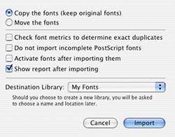 What FAP does is – and you have the option of ‘copying’ or ‘moving’ your font library (I always select ‘copy’, and leave the original library untouched) – processes all the fonts in a given location and organizes them into alphabetical folders, then grouped into subfolders arranged by family. Even those who might not choose to use FAP for management, and simply like having their fonts organized, should love the program for this feature alone. FAP also quarantines any font files it considers to be ‘problem’ fonts into their own folder, as well as any duplicates contained in your library. Importing new fonts into the app also follows this method- and you always have the option to customize the way FAP imports – whether or not to check for duplicates, to activate fonts after import, etc.
About how many fonts do you have installed, and how many do you typically keep loaded at any given time?
I have about 2700 fonts installed on my machine at the present, and I would say I have a few hundred active during the average work day. FAP has a feature that lets you keep auto-activated fonts permanently active even after you’ve completed the work that uses them, but I chose to permanently activate a set of my most-utilized fonts, and let the rest of my library activate and de-activate as they may. A special thanks to Pete for taking the time to share this info, and at the same time, save me a little time! As always, sound-off in the comments if you have something to add to the review regarding font management software.
The principals of design
 A great article for mental masturbation is available from Digital Web Magazine covering the principals of design.
