![]() If you have the occasion to combine all your layers in your Photoshop document, yet still have access to all the layers at the same time, you can use this little trick to do it. Create a new blank layer on top of all your other layers and hit Command + Shift + Option + E. This merges all the visible layers onto that new layer you created AND keeps all the old layers intact for further adjustment.
If you have the occasion to combine all your layers in your Photoshop document, yet still have access to all the layers at the same time, you can use this little trick to do it. Create a new blank layer on top of all your other layers and hit Command + Shift + Option + E. This merges all the visible layers onto that new layer you created AND keeps all the old layers intact for further adjustment.
Add round corner effects to any path in InDesign
Did you know the Corner Effects feature in Adobe InDesign works on ANY corner, not just rectangular shapes? You can get a rounded corner effect on a path shaped like an L – without having to hand draw it with the Bezier Curve tool to edit it for the effect.
OSX Dashboard keyboard shortcut

OS X Dashboard
Adjust skin tones in Photoshop easily
One of the most difficult color adjustments to do is skin. Too much red and you look sunburnt, not enough and your skin takes on a shade of yellow that can only be compared to an infants dirty diaper after eating peas. In the photo below, the handsome devil on the right looks pretty good, but that ugly guy on the left looks like he spent a little too much time in the sun the day before.

Original image with redish skintones
 First, select the area you want to edit (in this case, the face) and feather the selection a little to create a soft edge. Now, create an Adjustment Layer using the adjustment layer button at the bottom of the layers palette and select Hue/Saturation. By using an adjustment layer, we don’t lose the original and don’t have to bother saving the adjustment as a copy. Next, from the drop down menu, select the color you wish to adjust, in this case it’s Red. Now start moving the sliders around and watch the unwanted color disappear. Or if I really WANTED to look sunburned, I could add more red to the already red areas. You can see the results of a slight Red adjustment in the photo below. Notice that only the red areas were affected.
Adjusted skintones
Quick & dirty duotones in InDesign
If you’ve created the “quick & dirty” duotones in Quark XPress by placing a grayscale image and coloring it in QX, then this InDesign tip is for you. You can do the same thing in Adobe InDesign by selecting the picture frame with the Selection tool (solid arrow tool) containing your grayscale image (warning: this tip will convert your spot color image to CMYK) and choosing a color to fill the box with from the Swatches palette. Then, click on the image again with the Direct Select tool (the hollow arrow tool) and choose Darken in the mode drop down menu in the Transparency palette.
Changing fonts & sizes with arrow keys in InDesign
Did you know you can change fonts, font sizes, leading and more in Adobe InDesign using the arrow keys? Simply click in the field you want and use the arrow keys to increase measurements, select the next or previous font, etc.. Perfect for making small adjustments.
Cool Web site: Erik Otten
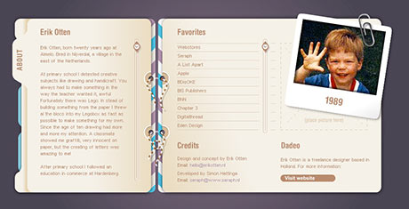
 As a rule, I don’t like the use of Flash for the entire Web site. I think it’s overkill, and it usually means that someone is trying to overcome their lack of creativity with bells & whistles. But every once in a while, I come across a site that is done completely in Flash, is creative and easy to navigate. Erik Otten has such a site. It’s his personal Web portfolio of design work that he’s done from his home in the Netherlands. I particularly like the Flash pre-loader graphic of the pencil scribbling progress bar. Very clever. Once loaded, the tabs on the left take you to the various sections of his site, and a scroll wheel appears on the right when there is more to read. Give it a quick once-over, it may provide some inspiration.
Creating compound paths in Illustrator
One of the most confusing things to do with Illustrator for new users is working with Compound Paths, which are responsible for taking two solid objects and combining them to make one of the objects a “hole” in the other. Let’s say you want to make a donut. You first draw a larger circle, then draw a second smaller circle over the first one which will be the hole. Now, simply select the objects and go to Object>Compound Path>Make. That’s it.
Convert images to gray in a PDF
Save your sanity, use CMYK Preview in Photoshop
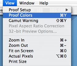
 I’m always amazed to see some print designers working in the RGB color space. It’s like a mechanic working on a car in the dark, you just don’t know what you’ll get when he’s done. Many filters and some color correction features only work in the RGB color space, but that doesn’t mean you have to “fly blind.” Try hitting Command + Y or select View>Proof Colors from the menu bar to see what your image will look like when converted to CMYK using your particular color settings. Many times, it will drastically alter your expectations and the results of your color edits. It will also allow you to continue using those filters and edits for color – and still know what you’ll get when you’re all done.
